Introduction:
- Data exploration is more efficient.
- Aggregations are easier to construct.
- The accuracy of the reports has improved.
- Report writing takes less time.
- In the future, reports will be easier to maintain.
Star Schemas:
Sales orders, product counts, prices, transactional dates and times, and quantities are all examples of observational or event data values found in fact tables. Several repeating values may be found in fact tables. One product, for example, may show several times in many rows for various consumers on different dates. Visuals may be created by combining these values. A visual of total sales orders, for example, is an aggregate of all sales orders in the fact table. It's usual to find columns in fact tables that are filled with numbers and dates. The numbers can represent measurement units, such as a selling amount, or keys, such as a customer ID. The dates, such as the order date or the shipping date, signify time that is being recorded.
Working with Tables:
- Because of the particular and user-friendly column and table attributes, navigation will be straightforward.
- To make your data structure easier to understand, you've combined or added tables.
- Have logical, high-quality links between tables.
Configure data model and build relationships between tables
To manage these relationships, go to Manage Relationships on the ribbon, where the following window will appear.
In this view, you can create, edit, and delete relationships between tables and also autodetect relationships that already exist. When you load your data into Power BI, the Autodetect feature will help you establish relationships between columns that are named similarly. Relationships can be inactive or active. Only one active relationship can exist between tables, which is discussed in a future module.
While the Manage Relationships feature allows you to configure relationships between tables, you can also configure table and column properties to ensure organization in your table structure.
Configure table and column properties
The Model view in Power BI desktop provides many options within the column properties that you can view or update. A simple method to get to this menu to update the tables and fields is by Ctrl+clicking or Shift+clicking items on this page.
Under the General tab, you can:
Edit the name and description of the column.
Add synonyms that can be used to identify the column when you are using the Q&A feature.
Add a column into a folder to further organize the table structure.
Hide or show the column.
Under the Formatting tab, you can:
Change the data type.
Format the date.
For instance, suppose that the dates in your column are formatted, as seen in the previous screenshot, in the form of "Wednesday, March 14, 2001". If you want to change the format so that the date was in the "mm/dd/yyyy" format, you would select the drop-down menu under All date time formats and then choose the appropriate date format, as shown in the following figure.
After selecting the appropriate date format, return to the Date column, where you should see that the format has indeed changed, as shown in the following figure.
Under the Advanced tab, you can:
Sort by a specific column.
Assign a specific category to the data.
Summarize the data.
Determine if the column or table contains null values.
Additionally, Power BI has a new functionality to update these properties on many tables and fields by Ctrl+clicking or Shift+clicking items.
Create a date table
During report creation in Power BI, a common business requirement is to make calculations based on date and time. Organizations want to know how their business is doing over months, quarters, fiscal years, and so on. For this reason, it is crucial that these time-oriented values are formatted correctly. Power BI autodetects for date columns and tables; however, situations can occur where you will need to take extra steps to get the dates in the format that your organization requires.
For example, suppose that you are developing reports for the Sales team at your organization. The database contains tables for sales, orders, products, and more. You notice that many of these tables, including Sales and Orders, contain their own date columns, as shown by the ShipDate and OrderDate columns in the Sales and Orders tables. You are tasked with developing a table of the total sales and orders by year and month. How can you build a visual with multiple tables, each referencing their own date columns?
To solve this problem, you can create a common date table that can be used by multiple tables. The following section explains how you can accomplish this task in Power BI.
Create a common date table
Ways that you can build a common date table are:
Source data
DAX
Power Query
Source data
Occasionally, source databases and data warehouses already have their own date tables. If the administrator who designed the database did a thorough job, these tables can be used to perform the following tasks:
Identify company holidays
Separate calendar and fiscal year
Identify weekends versus weekdays
Source data tables are mature and ready for immediate use. If you have a table as such, bring it into your data model and don't use any other methods that are outlined in this section. We recommend that you use a source date table because it is likely shared with other tools that you might be using in addition to Power BI.
If you do not have a source data table, you can use other ways to build a common date table.
DAX
You can use the Data Analysis Expression (DAX) functions CALENDARAUTO() or CALENDAR() to build your common date table. The CALENDAR() function returns a contiguous range of dates based on a start and end date that are entered as arguments in the function. Alternatively, the CALENDARAUTO() function returns a contiguous, complete range of dates that are automatically determined from your dataset. The starting date is chosen as the earliest date that exists in your dataset, and the ending date is the latest date that exists in your dataset plus data that has been populated to the fiscal month that you can choose to include as an argument in the CALENDARAUTO() function. For the purposes of this example, the CALENDAR() function is used because you only want to see the data from May 31, 2011 (the first day that Sales began its tracking of this data) and forward for the next 10 years.
In Power BI Desktop, go to the Table tab on the ribbon. Select New Table, and then enter in the following DAX formula:
Dates = CALENDAR(DATE(2011, 5, 31), DATE(2022, 12, 31))
Now, you have a column of dates that you can use. However, this column is slightly sparse. You also want to see columns for just the year, the month number, the week of the year, and the day of the week. You can accomplish this task by selecting New Column on the ribbon and entering the following DAX equation, which will retrieve the year from your Date table.
Year = YEAR(Dates[Date])
You can perform the same process to retrieve the month number, week number, and day of the week:
MonthNum = MONTH(Dates[Date])
WeekNum = WEEKNUM(Dates[Date])
DayoftheWeek = FORMAT(Dates[Date], "DDDD")
When you have finished, your table will contain the columns that are shown in the following figure.
You have now created a common date table by using DAX. This process only adds your new table to the data model; you will still need to establish relationships between your date table and the Sales and Order tables, and then mark your table as the official date table of your data model. However, before you complete those tasks, make sure that you consider another way of building a common date table: by using Power Query.
Power Query
You can use M-language, the development language that is used to build queries in Power Query, to define a common date table.
Select Transform Data in Power BI Desktop, which will direct you to Power Query. In the blank space of the left Queries pane, right-click to open the following drop-down menu, where you will select New Query > Blank Query.
In the resulting New Query view, enter the following M-formula to build a calendar table:
= List.Dates(#date(2011,05,31), 365*10, #duration(1,0,0,0))
For your sales data, you want the start date to reflect the earliest date that you have in your data: May 31, 2011. Additionally, you want to see dates for the next 11 years, including dates in the future. This approach ensures that, as new sales data flows in, you won't have to re-create this table. You can also change duration. In this case, you want a data point for every day, but you can also increment by hours, minutes, and seconds. The following figure shows the result.
After you have realized success in the process, you notice that you have a list of dates instead of a table of dates. To correct this error, go to the Transform tab on the ribbon and select Convert > To Table. As the name suggests, this feature will convert your list into a table. You can also rename the column to DateCol.
Next, you want to add columns to your new table to see dates in terms of year, month, week, and day so that you can build a hierarchy in your visual. Your first task is to change the column type by selecting the icon next to the name of the column and, in the resulting drop-down menu, selecting the Date type.
After you have finished selecting the Date type, you can add columns for year, months, weeks, and days. Go to Add Column, select the drop-down menu under Date, and then select Year, as shown in the following figure.
Notice that Power BI has added a column of all years that are pulled from DateCol.
Complete the same process for months, weeks, and days. After you have finished this process, the table will contain the columns that are shown in the following figure.
You have now successfully used Power Query to build a common date table.
The previous steps show how to get the table into the data model. Now, you need to mark your table as the official date table so that Power BI can recognize it for all future values and ensure that formatting is correct.
Mark as the official date table
Your first task in marking your table as the official date table is to find the new table on the Fields pane. Right-click the name of the table and then select Mark as date table, as shown in the following figure.
By marking your table as a date table, Power BI performs validations to ensure that the data contains zero null values, is unique, and contains continuous date values over a period. You can also choose specific columns in your table to mark as the date, which can be useful when you have many columns within your table. Right-click the table, select Mark as date table, and then select Date table settings. The following window will appear, where you can choose which column should be marked as Date.
Selecting Mark as date table will remove autogenerated hierarchies from the Date field in the table that you marked as a date table. For other date fields, the auto hierarchy will still be present until you establish a relationship between that field and the date table or until you turn off the Auto Date/Time feature. You can manually add a hierarchy to your common date table by right-clicking the year, month, week, or day columns in the Fields pane and then selecting New hierarchy. This process is further discussed later in this module.
Build your visual
To build your visual between the Sales and Orders tables, you will need to establish a relationship between this new common date table and the Sales and Orders tables. As a result, you will be able to build visuals by using the new date table. To complete this task, go to Model tab > Manage Relationships, where you can create relationships between the common date table and the Orders and Sales tables by using the OrderDate column. The following screenshot shows an example of one such relationship.
After you have built the relationships, you can build your Total Sales and Order Quantity by Time visual with your common date table that you developed by using the DAX or Power Query method.
To determine the total sales, you need to add all sales because the Amount column in the Sales table only looks at the revenue for each sale, not the total sales revenue. You can complete this task by using the following measure calculation, which will be explained in later discussions. The calculation that you will use when building this measure is as follows:
#Total Sales = SUM(Sales[‘Amount’])
After you have finished, you can create a table by returning to the Visualizations tab and selecting the Table visual. You want to see the total orders and sales by year and month, so you only want to include the Year and Month columns from your date table, the OrderQty column, and the #TotalSales measure. When you learn about hierarchies, you can also build a hierarchy that will allow you drill down from years to months. For this example, you can view them side-by-side. You have now successfully created a visual with a common date table.
Work with dimensions
When building a star schema, you will have dimension and fact tables. Fact tables contain information about events such as sales orders, shipping dates, resellers, and suppliers. Dimension tables store details about business entities, such as products or time, and are connected back to fact tables through a relationship.
You can use hierarchies as one source to help you find detail in dimension tables. These hierarchies form through natural segments in your data. For instance, you can have a hierarchy of dates in which your dates can be segmented into years, months, weeks, and days. Hierarchies are useful because they allow you to drill down into the specifics of your data instead of only seeing the data at a high level.
Hierarchies
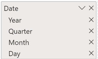
When you are building visuals, Power BI automatically enters values of the date type as a hierarchy (if the table has not been marked as a date table).
In the preceding Date column, the date is shown in increasingly finer detail through year, quarters, months, and days. You can also manually create hierarchies.
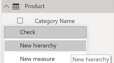
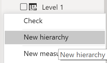
For example, consider a situation where you want to create a stacked bar chart of Total Sales by Category and Subcategory. You can accomplish this task by creating a hierarchy in the Product table for categories and subcategories. To create a hierarchy, go to the Fields pane on Power BI and then right-click the column that you want the hierarchy for. Select New hierarchy, as shown in the following figure.
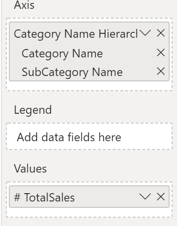
Next, drag and drop the subcategory column into this new hierarchy that you've created. This column will be added as a sublevel on the hierarchy.
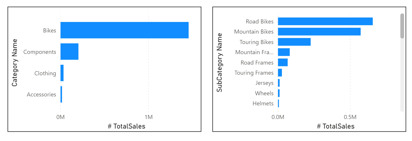
Now, you can build the visual by selecting a stacked bar chart in the Visualizations pane. Add your Category Name Hierarchy in the Axis field and Total Sales in the Values field.
You can drill down on the visual to view both Category and Subcategory, depending on what you want to see. Hierarchies allow you to view increasing levels of data on a single view.
Now that you have learned about hierarchies, you can take a step further and examine parent-child hierarchies and their role in multiple relationships between fact tables and dimension tables.
Parent-child hierarchy
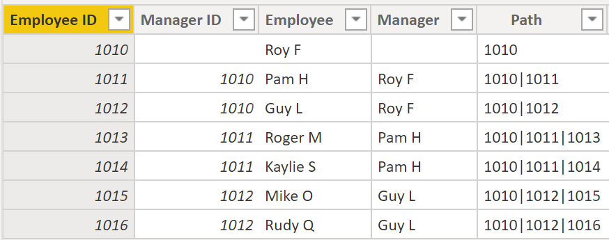
In the following example, you have an Employee table within the database that tells you important information about the employees, their managers, and their IDs. When looking at this table, you notice that Roy F has been repeated multiple times in the Manager column. As the image shows, multiple employees can have the same manager, which indicates a hierarchy between managers and employees.
The Manager column determines the hierarchy and is therefore the parent, while the "children" are the employees. For this example, you want to be able to see all levels of this hierarchy. Power BI does not default to showing you all levels of the hierarchy, so it is your responsibility to ensure that you see all levels of this hierarchy or "flatten" it so that you can see more data granularity.
Flatten parent-child hierarchy
The process of viewing multiple child levels based on a top-level parent is known as flattening the hierarchy. In this process, you are creating multiple columns in a table to show the hierarchical path of the parent to the child in the same record. You will use PATH(), a simple DAX function that returns a text version of the managerial path for each employee, and PATHITEM() to separate this path into each level of managerial hierarchy.
Important
DAX has not been covered yet; however, it will be in another module. This function is included in this section because it's explaining hierarchies. If use of DAX in this capacity is confusing, refer to the DAX module and then return to this section afterward.
While on the table, go to the Modeling tab and select New Column. In the resulting formula bar, enter the following function, which creates the text path between the employee and manager. This action creates a calculated column in DAX.
Path = PATH(Employee[Employee ID], Employee[Manager ID])
The completed path between the employee and the manager appears in the new column, as shown in the following screenshot.
If you look at Roger M, the path of IDs is 1010 | 1011 | 1013, which means that one level above Roger M (ID 1013) is his manager, Pam H (ID 1011), and one level above Pam H is her manager Roy F (ID 1010). In this row, Roger M is on the bottom of the hierarchy, at the child level, and Roy F is at the top of the hierarchy and is at the parent level. This path is created for every employee. To flatten the hierarchy, you can separate each level by using the PATHITEM function.
To view all three levels of the hierarchy separately, you can create four columns in the same way that you did previously, by entering the following equations. You will use the PATHITEM function to retrieve the value that resides in the corresponding level of your hierarchy.
- Level 1 = PATHITEM(Employee[Path],1)
- Level 2 = PATHITEM(Employee[Path],2)
- Level 3 = PATHITEM(Employee[Path],3)
After you have finished, notice that you now have each level of hierarchy within your table. Roy F is at the top of the hierarchy and, as you go through Levels 2-3, notice that the managers and employees map with each other.
Now, you can create a hierarchy on the Fields pane, as you did previously. Right-click Level 1, because this is the first hierarchy level, and then select New Hierarchy. Then, drag and drop Level 2 and Level 3 into this hierarchy.
You have now successfully flattened a hierarchy so that you can view individual levels.
Previously, you've considered dimensions that have only one relationship with a fact table. However, situations do occur where your dimension table will have multiple relationships with a fact table.
Role-playing dimensions
Role-playing dimensions have multiple valid relationships with fact tables, meaning that the same dimension can be used to filter multiple columns or tables of data. As a result, you can filter data differently depending on what information you need to retrieve. This topic is complex, so it is only introduced in this section. Working with role-playing dimensions requires complex DAX functions that will be discussed in later sections.
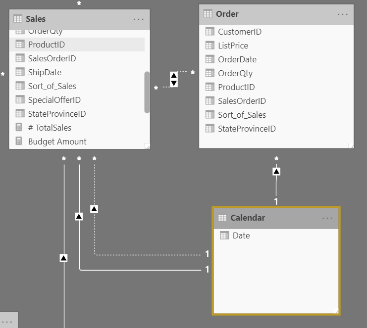
The preceding visual shows the Calendar, Sales, and Order tables. Calendar is the dimension table, while Sales and Order are fact tables. The dimension table has two relationships: one with Sales and one with Order. This example is of a role-playing dimension because the Calendar table can be used to group data in both Sales and Order. If you wanted to build a visual in which the Calendar table references the Order and the Sales tables, the Calendar table would act as a role-playing dimension.
Data Granularity:
Data granularity is the detail that is represented within your data, meaning that the more granularity your data has, the greater the level of detail within your data.
Data granularity is an important topic for all data analysts, regardless of the Power BI tools that you are using. Defining the correct data granularity can have a big impact on the performance and usability of your Power BI reports and visuals.
Change data granularity to build a relationship between two tables
Data granularity can also have an impact when you are building relationships between tables in Power BI.
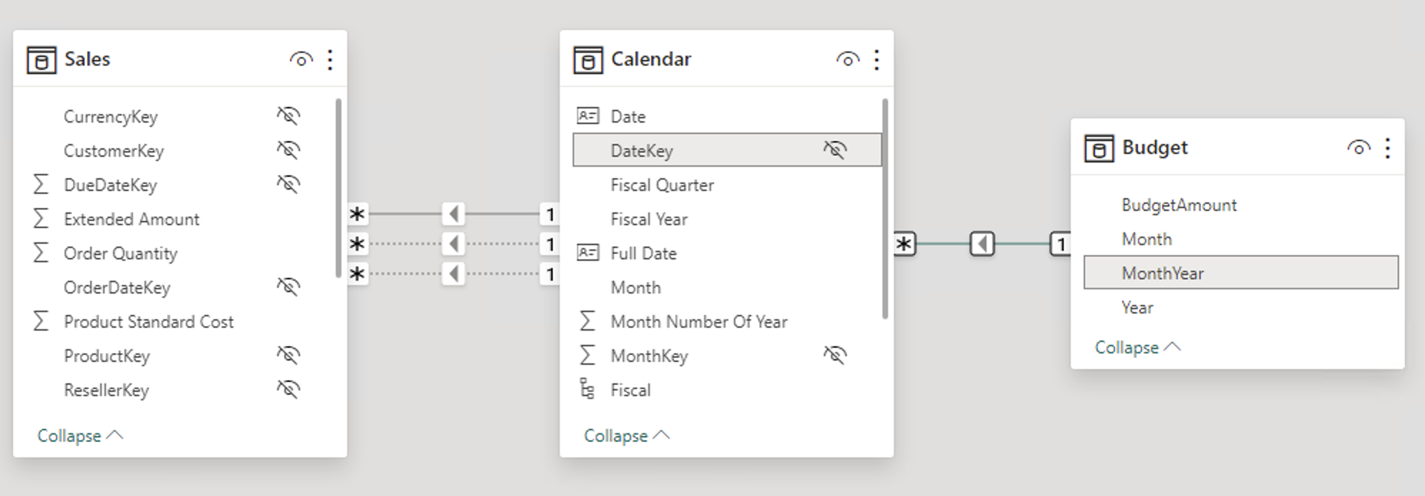
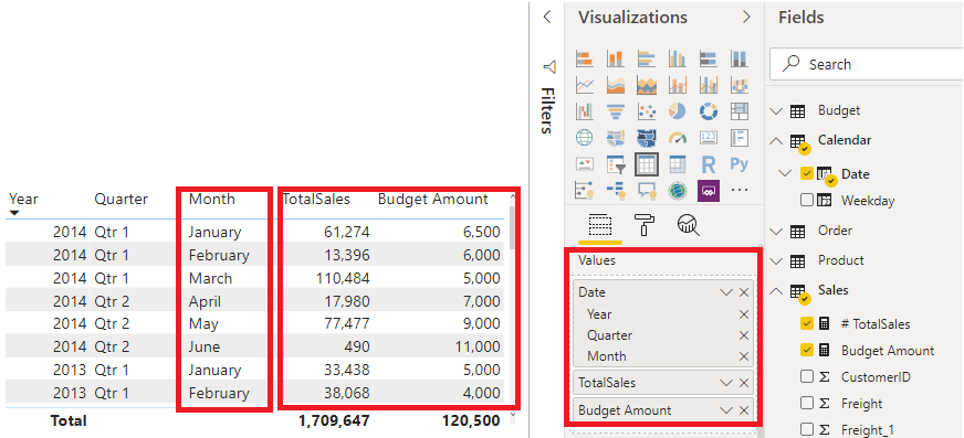
For example, consider that you are building reports for the Sales team at Tailwind Traders. You have been asked to build a matrix of total sales and budget over time by using the Calendar, Sales, and Budget tables. You notice that the lowest level of time-based detail that the Sales table goes into is by day, for instance 5/1/2020, 6/7/2020, and 6/18/2020. The Budget table only goes to the monthly level, for instance, the budget data is 5/2020 and 6/2020.These tables have different granularities that need to be reconciled before you can build a relationship between tables.
The following figure shows your current data model.
As shown in the preceding figure, a relationship between Budget and Calendar is missing. Therefore, you need to create this relationship before you can build your visual. Notice that if you transform the Year and Month columns in the Calendar table into a new column, and do the same transformation in the Budget table, you can match the format of the Date column in the Calendar table. Then, you can establish a relationship between the two columns. To complete this task, you will concatenate the Year and Month columns and then change the format.
Select Transform Data on the ribbon. On Applied Steps, on the right pane, right-click the last step and then select Insert Step After.
Under Add Column on the Home ribbon, select Custom Column. Enter the following equation, which will concatenate the Year and Month columns, and then add a dash in between the column names.
Column = Table.AddColumn(#"Renamed Columns", "Custom", each [Year] & "-" &[Month])
Change the data type to Date and then rename the column. Your Budget table should resemble the following figure.
Now, you can create a relationship between the Budget and the Calendar tables.
Create a relationship between tables
Power BI automatically detects relationships, but you can also go to Manage Relationships > New and create the relationship on the Date column. The relationship should resemble the following figure.
By completing this task, you have ensured that the granularity is the same between your different tables. Now, you need to create DAX measures to calculate Total Sales and BudgetAmount. Go to the Data pane on Power BI Desktop, select New Measure, and then create two measures with the following equations:
TotalSales = SUM(Sales[Total Sales])
BudgetAmount = SUM (Budget[BudgetAmount])
Select the table visual on the Visualization pane, and then enter these measures and the Date into the Values field. You have now accomplished the goal of building a matrix of the total sales and budgets over time.
Work with relationships and cardinality
Unlike other database management systems, Power BI has the concept of directionality to a relationship. This directionality, or cardinality, plays an important role in filtering data between multiple tables. When you load data, Power BI automatically looks for relationships that exist within the data by matching column names. You can also use Manage Relationships to edit these options manually.
For example, you've retrieved many tables from the Sales database, and the following image is an example of your data model. Power BI has autodetected several relationships, but you can't discern what they mean. You want to make sure that the relationships accurately reflect those that exist in your data.
Cardinality
The following are different types of cardinality that you'll find in Power BI.
Many-to-one (*:1) or one-to-many (1: *) cardinality:
Describes a relationship in which you have many instances of a value in one column that are related to only one unique corresponding instance in another column.
Describes the directionality between fact and dimension tables.
Is the most common type of directionality and is the Power BI default when you are automatically creating relationships.
An example of a one-to-many relationship would be between the CountryName and Territory tables, where you can have many territories that are associated with one unique country.
One-to-one (1:1) cardinality:
Describes a relationship in which only one instance of a value is common between two tables.
Requires unique values in both tables.
Is not recommended because this relationship stores redundant information and suggests that the model is not designed correctly. It is better practice to combine the tables.
An example of a one-to-one relationship would be if you had products and product IDs in two different tables. Creating a one-to-one relationship is redundant and these two tables should be combined.
Many-to-many (.) cardinality:
Describes a relationship where many values are in common between two tables.
Does not require unique values in either table in a relationship.
Is not recommended; a lack of unique values introduces ambiguity and your users might not know which column of values is referring to what.
For instance, the following figure shows a many-to-many relationship between the Sales and Order tables on the OrderDate column because multiple sales can have multiple orders associated with them. Ambiguity is introduced because both tables can have the same order date.
Cross-filter direction
Data can be filtered on one or both sides of a relationship.
With a single cross-filter direction:
Only one table in a relationship can be used to filter the data. For instance, Table 1 can be filtered by Table 2, but Table 2 cannot be filtered by Table 1.
Tip
Follow the direction of the arrow on the relationship between your tables to know which direction the filter will flow. You typically want these arrows to point to your fact table.
For a one-to-many or many-to-one relationship, the cross-filter direction will be from the "one" side, meaning that the filtering will occur in the table that has many values.
With both cross-filter directions or bi-directional cross-filtering:
One table in a relationship can be used to filter the other. For instance, a dimension table can be filtered through the fact table, and the fact tables can be filtered through the dimension table.
You might have lower performance when using bi-directional cross-filtering with many-to-many relationships.
A word of caution regarding bi-directional cross-filtering: You should not enable bi-directional cross-filtering relationships unless you fully understand the ramifications of doing so. Enabling it can lead to ambiguity, over-sampling, unexpected results, and potential performance degradation.
Cardinality and cross-filter direction
For one-to-one relationships, the only option that is available is bi-directional cross-filtering. Data can be filtered on either side of this relationship and result in one distinct, unambiguous value. For instance, you can filter on one Product ID and be returned a single Product, and you can filter on a Product and be returned a single Product ID.
For many-to-many relationships, you can choose to filter in a single direction or in both directions by using bi-directional cross-filtering. The ambiguity that is associated with bi-directional cross-filtering is amplified in a many-to-many relationship because multiple paths will exist between different tables. If you create a measure, calculation, or filter, unintended consequences can occur where your data is being filtered and, depending on which relationship that the Power BI engine chooses when applying the filter, the final result might be different. This situation is also true for bi-directional relationships and why you should be cautious when using them.
For this reason, many-to-many relationships and/or bi-directional relationships are complicated. Unless you are certain what your data looks like when aggregated, these types of open-ended relationships with multiple filtering directions can introduce multiple paths through the data.
Create many-to-many relationships
Consider the scenario where you are tasked with building a visual that examines budgets for customers and accounts. You can have multiple customers on the same account and multiple accounts with the same customer, so you know that you need to create a many-to-many relationship.
To create this relationship, go to Manage Relationships > New. In the resulting window, create a relationship between the Customer ID column in CustomerTable and AccountTable. The cardinality is set to many-to-many, and the filter type is in both directions. Immediately, you will be warned that you should only use this type of relationship if it is expected that neither column will have unique values because you might get unexpected values. Because you want to filter in both directions, choose bi-directional cross-filtering.
Select OK. You have now successfully created a many-to-many relationship.











No comments:
Post a Comment