Monday, November 29, 2021

Using Visuals in power bi


Introduction to visuals in Power BI

Completed100 XP

Visuals enable you to display data in an attractive and intuitive manner, as well as to highlight key elements. Many eye-catching graphics are available in Power BI, with more being added on a regular basis.

Visualizing data is one of the core parts and basic building blocks of Power BI. Creating visuals is one of the most effective ways to find and share your insights.

Two ways to create a new visualization in Power BI Desktop are:

  • Drag field names from the Fields pane and then drop them on the report canvas. By default, your visualization appears as a table of data.
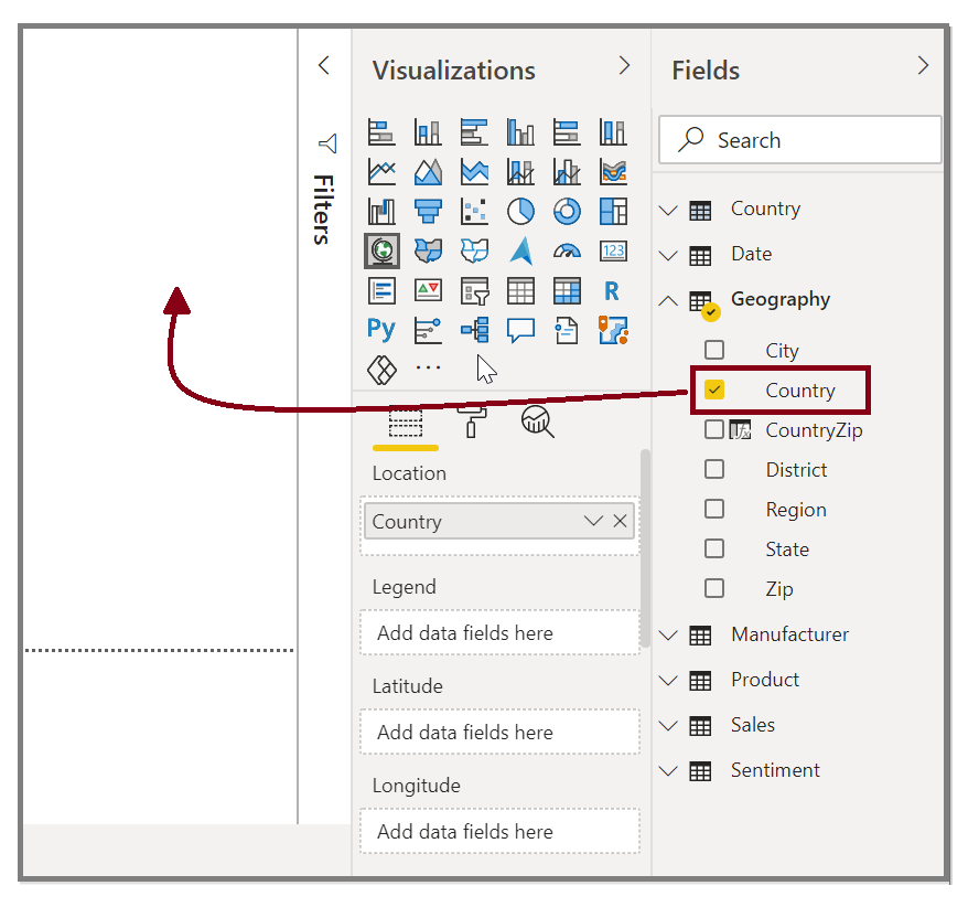
    Drag the "Country" field onto the canvas to create a visual.

  • In the Visualizations pane, select the type of visualization that you want to create. With this method, the default visual is a blank placeholder that resembles the type of visual that you selected.
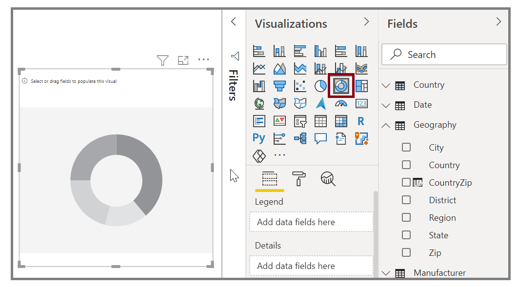
    Screenshot of a visual selected on the Visualizations pane.

After you have created your graph, map, or chart, you can begin dragging data fields onto the bottom portion of the Visualization pane to build and organize your visual. The available fields will change based on the type of visualization that you selected. As you drag and drop data fields, your visualization will automatically update to reflect changes.
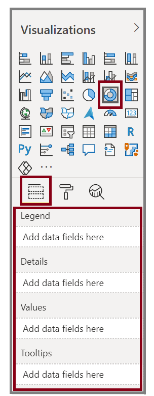
Screenshot of the Visualizations options.

You can resize your visual by selecting it and then dragging the handles in or out. You can also move your visualization anywhere on the canvas by selecting and then dragging it to where you want it. If you want to convert between different types of visuals, select the visual that you want to change and select a different visual from the Visualization pane. Power BI attempts to convert your selected fields to the new visual type as closely as possible.

As you hover over parts of your visuals, you'll receive a tooltip that contains details about that segment, such as labels and total value.

Select the paintbrush icon on the Visualizations pane to make cosmetic changes to your visual. Examples of cosmetic changes include background, alignment, title text, and data colors.

Screenshot of the Visualizations format pane.

The available options for cosmetic changes to your visual vary depending on the type of visual that you've selected.


Create combination charts

Combination charts are an effective way to visualize multiple measures that have different scales in a single visualization.

You might want to visualize two measures with different scales, such as revenue and units. Use a combination chart to show a line and a bar with different axis scales. Power BI supports many different types of combination charts by default, including Line and Stacked Columns charts.
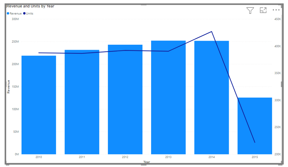
Image of a line and bar chart combined in the same visual.

You can split each column by category by dragging a category into the Column Series field. When you do so, each bar is proportionately colored based on the values within each category.


Create slicers

Completed100 XP

Slicers are one of the most useful sorts of visualizations, especially when used in conjunction with a busy report. A slicer is a visual filter that appears on the report's canvas and allows users to separate data by a certain value. Filters can be applied by year or by geographic place, for example.


To add a slicer to your report, select Slicer from the Visualizations pane.
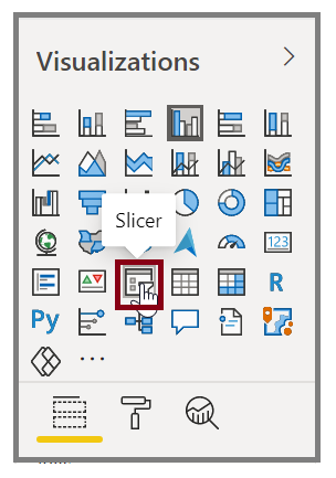
Image of the Slicer button on the Visualizations pane.

Drag the field by which you want to slice and drop it to the top of the slicer placeholder. The visualization turns into a list of elements with check boxes. These elements are your filters. Select the box next to the one that you want to segment, and Power BI will filter, or slice, all other visuals on the same report page.
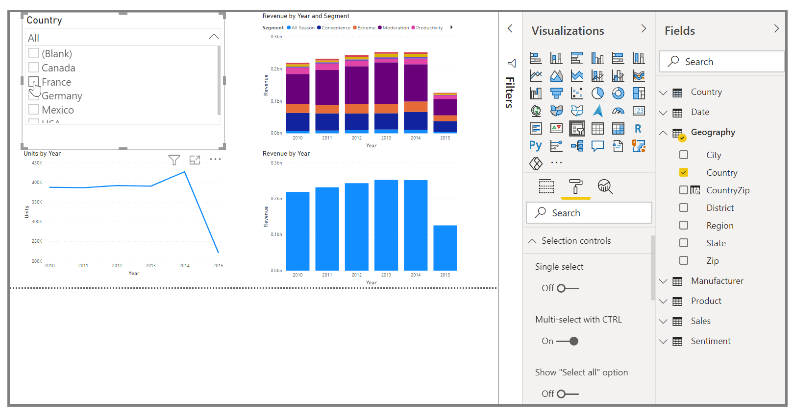
Image of a field dragged onto the slicer placeholder.

A few different options are available to help you format your slicer. You can set it to accept multiple inputs at once, or you can use the Single Select mode to use one at a time. You can also add a Select All option to your slicer elements, which is helpful when you have a long list. Change the orientation of your slicer from the vertical default to horizontal, and it becomes a selection bar rather than a checklist.
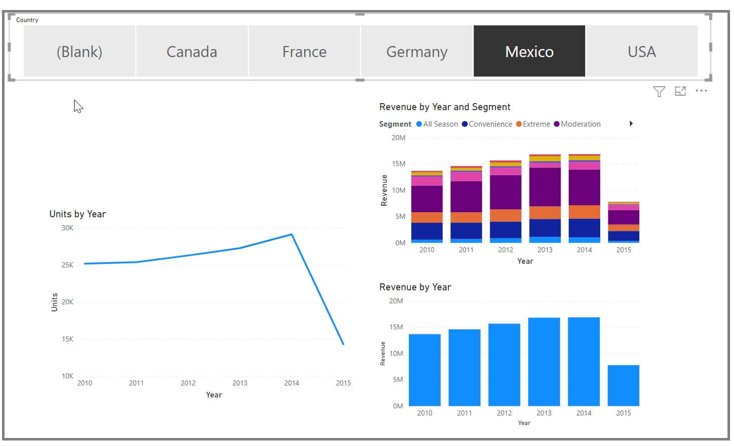
Image of of slicer formatting options.

When you have multiple visualizations on the same report page, Power BI Desktop lets you control how interactions flow between visuals. 


Map visualizations

Completed100 XP

Power BI has two different types of map visualizations: a bubble map that places a bubble over a geographic point, and a shape map that shows the outline of the area that you want to visualize.

Create bubble maps

To create a bubble map, select the Map option in the Visualization pane. In the Visualizations options, add a value to the Location bucket to use a map visual.
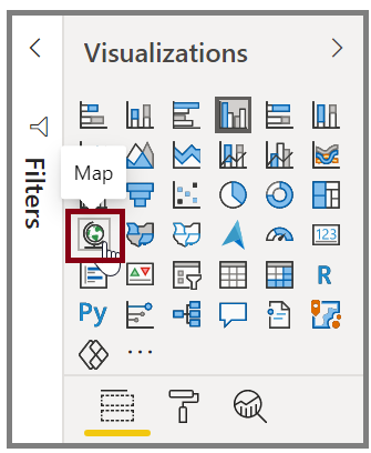
Image of the Map button on the Visualizations pane.

Power BI accepts many types of location values. It recognizes city names, airport codes, or specific latitude and longitude data. Add a field to the Size bucket to change the size of the bubble for each map location.
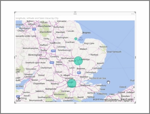
Image of resized bubbles on map visual.

Create shape maps

To create a shape map, select the Filled Map option in the Visualization pane. As with bubble maps, you must add a value to the Location bucket to use this visual. Add a field to the Size bucket to change the intensity of the fill color.
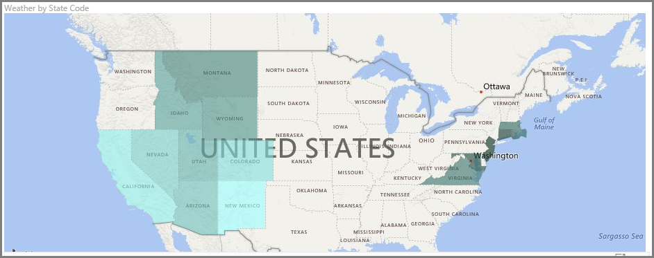
Image of map with different shaded state fills.

A warning icon in the top-left corner of your visual indicates that the map needs more location data to accurately plot values. This is a common problem when the data in your location field is ambiguous, such as using an area name like Washington, which could indicate a state or a district.

One way to resolve the location data problem is to rename your column to be more specific, such as State. Another way is to manually reset the data category by selecting Data Category on the Column tools tab. From the Data Category list, you can assign a category to your data such as "State" or "City."

MATRICES AND TABLES


If you have numerical information in a table, such as revenue, a total sum will appear at the bottom. You can manually sort by each column by selecting the column header to switch ascending or descending order. If a column isn't wide enough to display all its contents, select and drag the column header to expand it.

In the Visualizations pane, the order of the fields in the Values bucket determines the order in which they appear in your table.
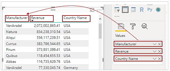
Screenshot of how values in the Visualization pane match the order of fields on a table.

A matrix is similar to a table, but it has different category headers on the columns and rows. As with tables, numerical information will be automatically totaled along the bottom and right side of the matrix.
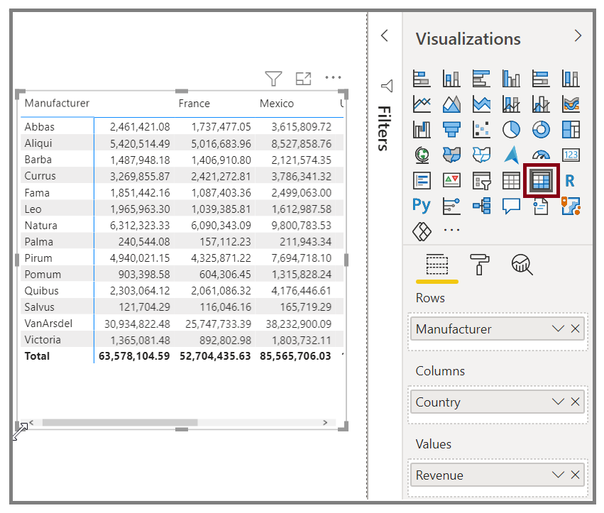
Image of the Matrix button in the Visualizations pane and the resulting matrix.

Many cosmetic options are available for matrices, such as auto-sizing columns, switching between row and column totals, setting colors, and more.


Create scatter, waterfall, and funnel charts

Completed100 XP

Use a scatter chart to compare two different measures, such as unit sales versus revenue.

To create a blank chart, select Scatter chart from the Visualizations pane. Drag and drop the two fields that you want to compare from the Fields pane to the X Axis and Y Axis option buckets. At this point, your scatter chart probably has a small bubble in the center of the visual. You need to add a measure to the Details bucket to indicate how you want to segment your data. For example, if you're comparing item sales and revenue, you might want to split the data by category, or manufacturer, or month of sale.

Adding another field to the Legend bucket will color-code your bubbles according to the field's value. You can also add a field to the Size bucket to alter the bubble size according to that value.

Image of a color-coded scatter chart.

Scatter charts have many visual formatting options as well, such as turning on an outline for each colored bubble and switching between individual labels. You can change the data colors for other chart types as well.

Screenshot of the Scatter chart button and the formatting options.

You can create an animation of your bubble chart's changes over time by adding a time-based field to the Play Axis bucket. Select a bubble during an animation to see a trace of its path.

Screenshot of an animated bubble chart.

Create waterfall and funnel charts

Waterfall and funnel charts are two of the more noteworthy (and uncommon) standard visualizations that are included in Power BI. To create a blank chart of either type, select its icon from the Visualizations pane.

Waterfall charts are typically used to show changes in a specific value over time.

Image of a typical waterfall chart.

Waterfalls only have two bucket options: Category and Y Axis. Drag a time-based field, such as Year, to the Category bucket, and drag the value that you want to track to the Y Axis bucket. Time periods where an increase in value occurred are displayed in green by default, while periods with a decrease in value are displayed in red.

Funnel charts are typically used to show changes over a specific process, such as a sales pipeline or website retention efforts.

Image of a typical funnel chart.

You can slice and customize Waterfall and Funnel charts.

Friday, November 26, 2021

Modelling of Data in Power BI

OVERVIEW:

To build your reports, we will frequently link to many data sources. To build a coherent report, all of the data must operate together. Modeling is the process of preparing your linked data for utilization. You may use Power BI to make a logical connection between disparate data sources by creating a relationship. A relationship allows Power BI to link tables so that graphics and reports can be created.

MANAGING DATA RELATIONSHIPS:

In Power BI Desktop, you can use the Model view to graphically set the connection between tables or objects. Two or more tables are connected together because they contain similar data in a relationship. This allows users to conduct searches across many tables for relevant data. To get a diagrammatic version of your data, use the Model view.
Adding and removing relationships is straightforward. To remove a relationship, right-click the relationship and select Delete. To create a relationship, drag and drop the fields that you want to link between tables.


To hide a table or individual column from your report, right-click the table or column in the Model view and select Hide in report view.

CREATING CALCULATED COLUMNS:

Sometimes the data you're studying lacks a field that you want in order to achieve the findings you want. Calculated columns come into play here. Calculated columns employ Data Analysis Expressions (DAX) formulae to specify the values of a column, which might range from combining text values from many columns to computing a numeric value from other data. Let's imagine you have data with City and State variables, but you want to combine them into a single Location field, such as "Miami, FL." Calculated columns are designed specifically for situations like these.
Calculated columns and measures are similar in that they are both based on DAX formulae, but they are utilized differently. Measures are frequently used in the Values area of a visualization to calculate results depending on other fields. In the rows, axes, legends, and group areas of visualizations, you employ computed columns as new Fields.   

In your Sales Report, you want to display product categories and subcategories as single values, like "Cell phones – Accessories", "Cell phones – Smartphones & PDAs", and so on. There's no field in the Fields list that gives you that data, but there is a ProductCategory field and a ProductSubcategory field, each in its own table. You can create a calculated column that combines values from these two columns. DAX formulas can leverage the full power of the model you already have, including relationships between different tables that already exist.

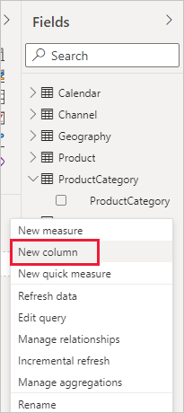
  1. To create your new column in the ProductSubcategory table, right-click or select the ellipsis ... next to ProductSubcategory in the Fields pane, and select New column from the menu.

    New Column

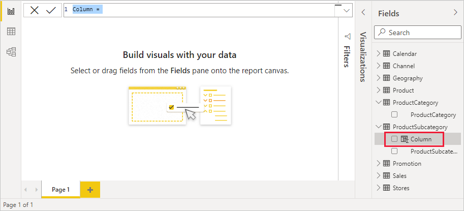
    When you select New column, the Formula bar appears along the top of the Report canvas, ready for you to name your column and enter a DAX formula.

    Formula bar

  2. By default, a new calculated column is named Column. If you don’t rename it, additional new columns will be named Column 2Column 3, and so on. You want your column to be more identifiable, so while the Column name is already highlighted in the formula bar, rename it by typing ProductFullCategory, and then type an equals (=) sign.

  3. You want the values in your new column to start with the name in the ProductCategory field. Because this column is in a different but related table, you can use the RELATED function to help you get it.

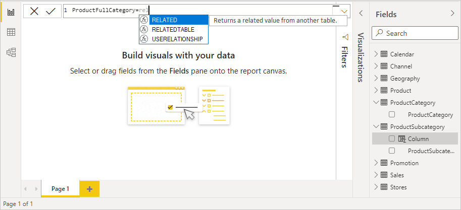
    After the equals sign, type r. A dropdown suggestion list shows all of the DAX functions beginning with the letter R. Selecting each function shows a description of its effect. As you type, the suggestion list scales closer to the function you need. Select RELATED, and then press Enter.

    Choose RELATED

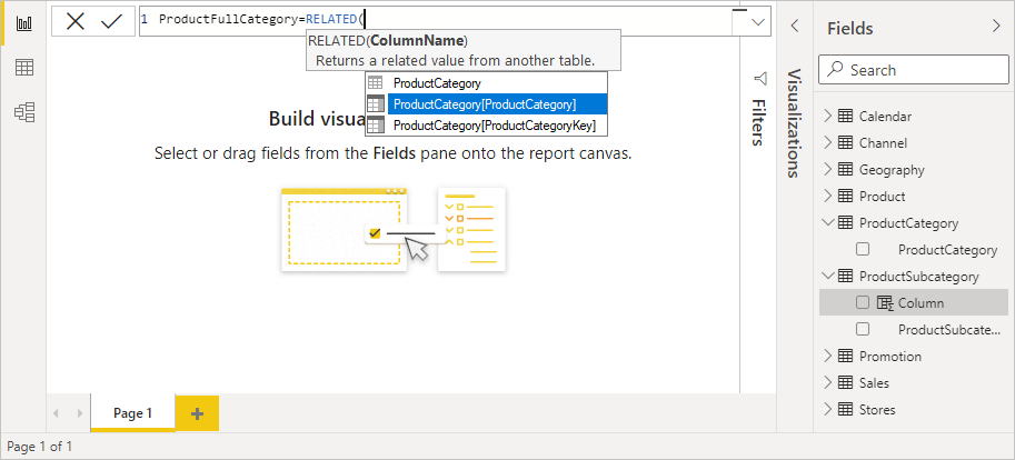
    An opening parenthesis appears, along with another suggestion list of the related columns you can pass to the RELATED function, with descriptions and details of expected parameters.

    Choose ProductCategory

  4. You want the ProductCategory column from the ProductCategory table. Select ProductCategory[ProductCategory], press Enter, and then type a closing parenthesis.

  5. You want dashes and spaces to separate the ProductCategories and ProductSubcategories in the new values, so after the closing parenthesis of the first expression, type a space, ampersand (&), double-quote ("), space, dash (-), another space, another double-quote, and another ampersand. Your formula should now look like this:

    ProductFullCategory = RELATED(ProductCategory[ProductCategory]) & " - " &

  6. Enter an opening bracket ([), and then select the [ProductSubcategory] column to finish the formula.

    Choose ProductSubcategory

    You didn’t need to use another RELATED function to call the ProductSubcategory table in the second expression, because you are creating the calculated column in this table. You can enter [ProductSubcategory] with the table name prefix (fully-qualified) or without (non-qualified).

  7. Complete the formula by pressing Enter or selecting the checkmark in the formula bar. The formula validates, and the ProductFullCategory column name appears in the ProductSubcategory table in the Fields pane.

    Finished ProductFullCategory column

OPTIMIZING DATA MODELS:


Imported data frequently contains fields that aren't required for reporting and visualization. It's possible that the data contains superfluous information, or that it's accessible in another column. Power BI Desktop has tools to help you improve your data and make it more useable for reports and visualizations.

Set the Sort by column:

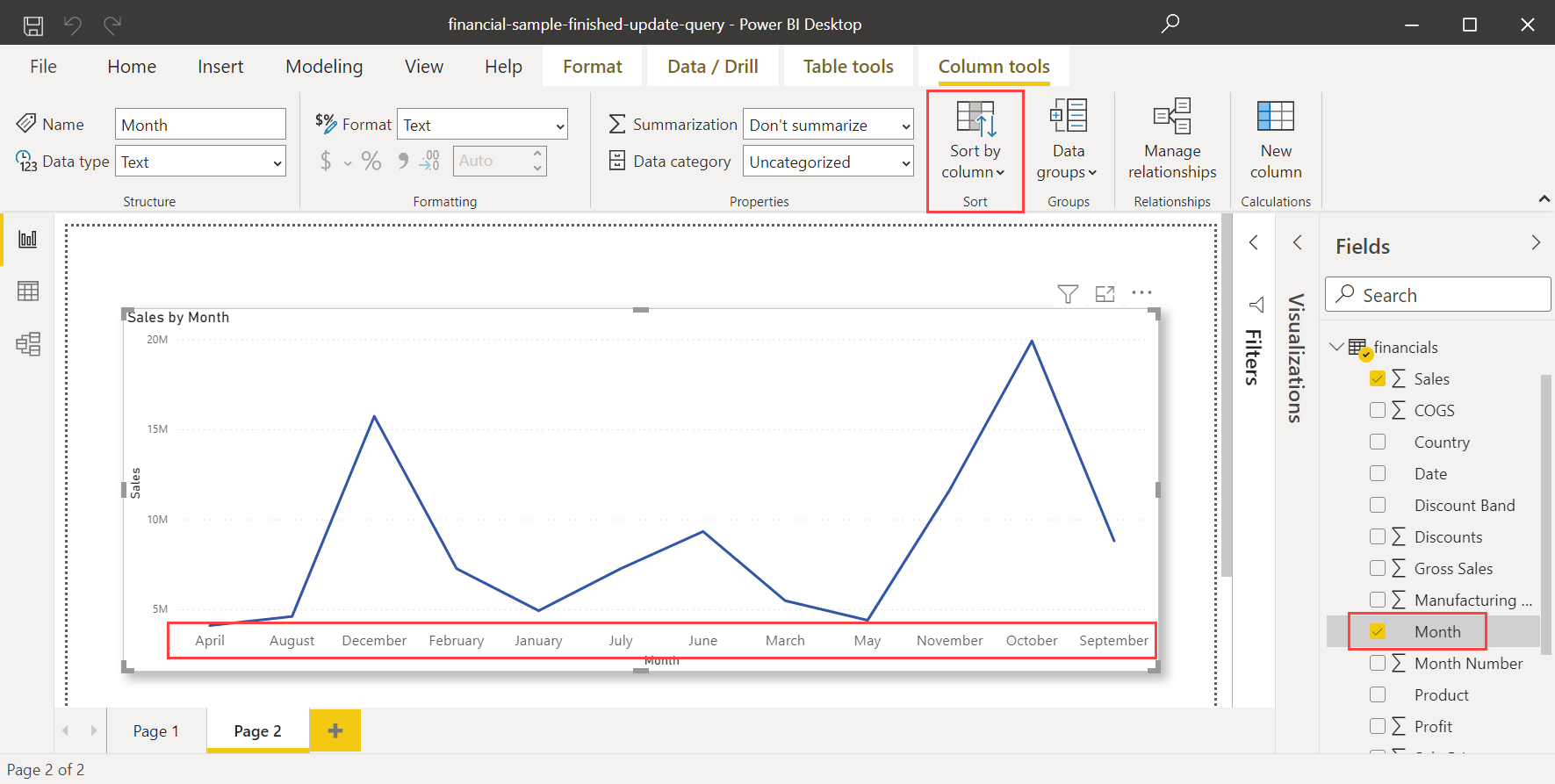
To set a different column to sort by, both columns need to be at the same level of granularity. For example, to sort a column of month names, you need a column that contains a number for each month. The sort order will apply to any visual in the report that contains the sorted column. In the following example, the months are being sorted alphabetically, but we want them to be sorted chronologically.

  1. Select the column that you want to sort, in our case, Month. Note that the months in the visual are sorted alphabetically. In the Fields pane, the Column tools tab becomes active.

    Active Sort by Column button, visual sorted alphabetically

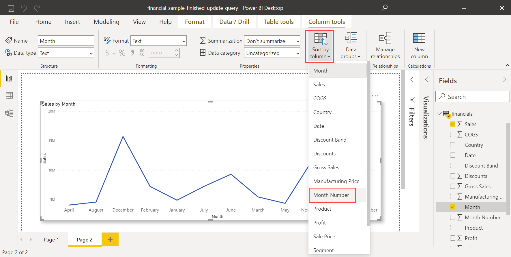
  2. Select Sort by Column, then select the field you want to sort the other field by, in this case, Month Number.

    Sort by Column menu, select Month Number

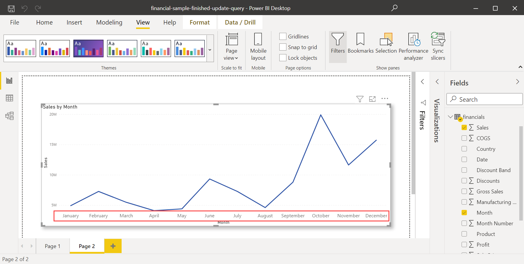
  3. The visual automatically sorts in the order we want: chronologically by the order of months in a year.

    Sort by Column menu, visual sorted chronologically


CREATING MEASURES:

In Power BI Desktop, you can develop some of the most sophisticated data analysis solutions by employing measurements. As you engage with your reports, measures assist you by conducting calculations on your data. This article will walk you through the basics of measures and how to create your own in Power BI Desktop.

To create a measure, follow these steps:

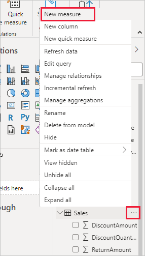
  1. In the Fields pane, right-click the Sales table, or hover over the table and select More options .

  2. From the menu that appears, select New measure.

    This action saves your new measure in the Sales table, where it's easy to find.

    New measure from list

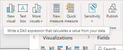
    You can also create a new measure by selecting New Measure in the Calculations group on the Home tab of the Power BI Desktop ribbon.

    New measure from ribbon


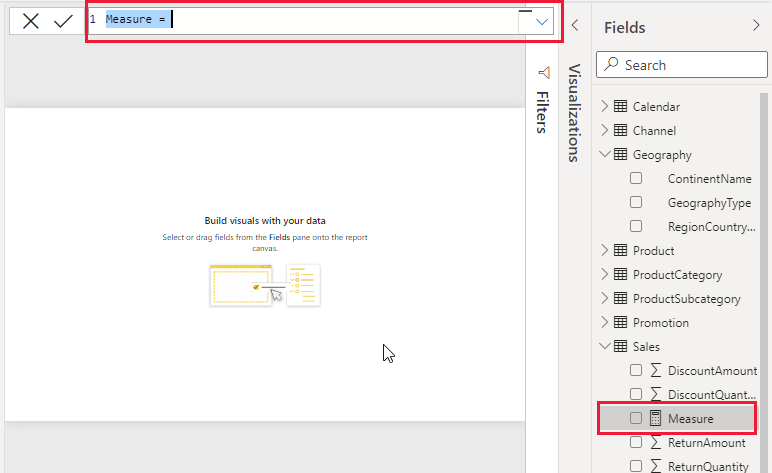
    The formula bar appears along the top of the report canvas, where you can rename your measure and enter a DAX formula.

    Formula bar

  3. By default, each new measure is named Measure. If you don’t rename it, additional new measures are named Measure 2Measure 3, and so on. Because we want this measure to be more identifiable, highlight Measure in the formula bar, and then change it to Net Sales.

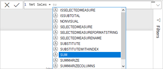
  4. Begin entering your formula. After the equals sign, start to type Sum. As you type, a drop-down suggestion list appears, showing all the DAX functions, beginning with the letters you type. Scroll down, if necessary, to select SUM from the list, and then press Enter.

    Choose SUM from list

    An opening parenthesis appears, along with a drop-down suggestion list of the available columns you can pass to the SUM function.

    Choose column

  5. Expressions always appear between opening and closing parentheses. For this example, your expression contains a single argument to pass to the SUM function: the SalesAmount column. Begin typing SalesAmount until Sales(SalesAmount) is the only value left in the list.

    The column name preceded by the table name is called the fully qualified name of the column. Fully qualified column names make your formulas easier to read.

    Select SalesAmount

  6. Select Sales[SalesAmount] from the list, and then enter a closing parenthesis.


  7. Subtract the other two columns inside the formula:

    a. After the closing parenthesis for the first expression, type a space, a minus operator (-), and then another space.

    b. Enter another SUM function, and start typing DiscountAmount until you can choose the Sales[DiscountAmount] column as the argument. Add a closing parenthesis.

    c. Type a space, a minus operator, a space, another SUM function with Sales[ReturnAmount] as the argument, and then a closing parenthesis.

    Complete formula

  8. Press Enter or select Commit (checkmark icon) in the formula bar to complete and validate the formula.

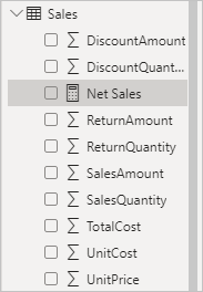
    The validated Net Sales measure is now ready to use in the Sales table in the Fields pane.

    Net Sales measure in Sales table field list

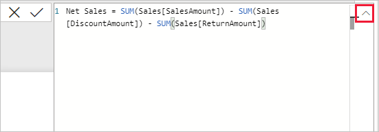
  9. If you run out of room for entering a formula or want it on separate lines, select the down arrow on the right side of the formula bar to provide more space.

    The down arrow turns into an up arrow and a large box appears.

    Formula up arrow

  10. Separate parts of your formula by pressing Alt + Enter for separate lines, or pressing Tab to add tab spacing.

    Formula expanded

Use your measure in the report

Add your new Net Sales measure to the report canvas, and calculate net sales for whatever other fields you add to the report.

To look at net sales by country:

  1. Select the Net Sales measure from the Sales table, or drag it onto the report canvas.

  2. Select the RegionCountryName field from the Geography table, or drag it onto the Net Sales chart.

    Net Sales by Country

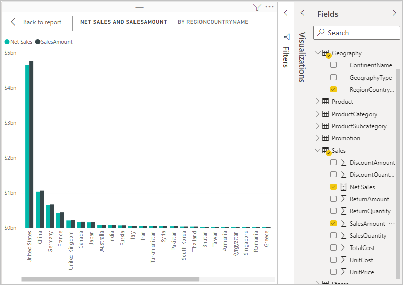
  3. To see the difference between net sales and total sales by country, select the SalesAmount field or drag it onto the chart.

    Sales Amount and Net Sales by Country

    The chart now uses two measures: SalesAmount, which Power BI summed automatically, and the Net Sales measure, which you manually created. Each measure was calculated in the context of another field, RegionCountryName.

Use your measure with a slicer

Add a slicer to further filter net sales and sales amounts by calendar year:

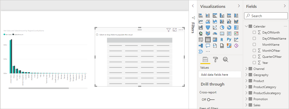
  1. Select a blank area next to the chart. In the Visualizations pane, select the Table visualization.

    This action creates a blank table visualization on the report canvas.

    New blank table visualization

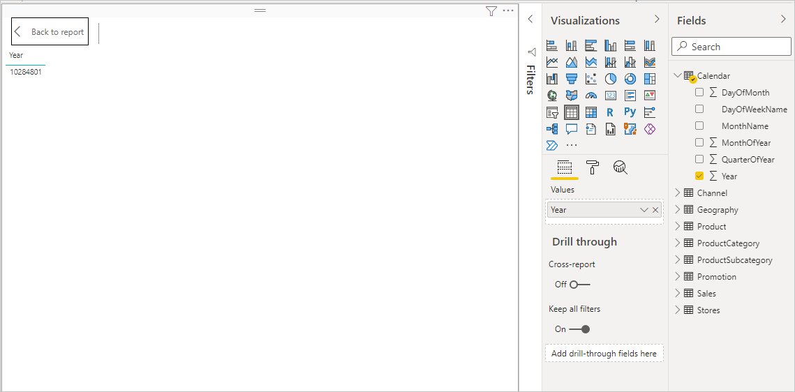
  2. Drag the Year field from the Calendar table onto the new blank table visualization.

    Because Year is a numeric field, Power BI Desktop sums up its values. This summation doesn’t work well as an aggregation; we'll address that in the next step.

    Year aggregation

  3. In the Values box in the Visualizations pane, select the down arrow next to Year, and then select Don't summarize from the list. The table now lists individual years.

    Select Don't summarize

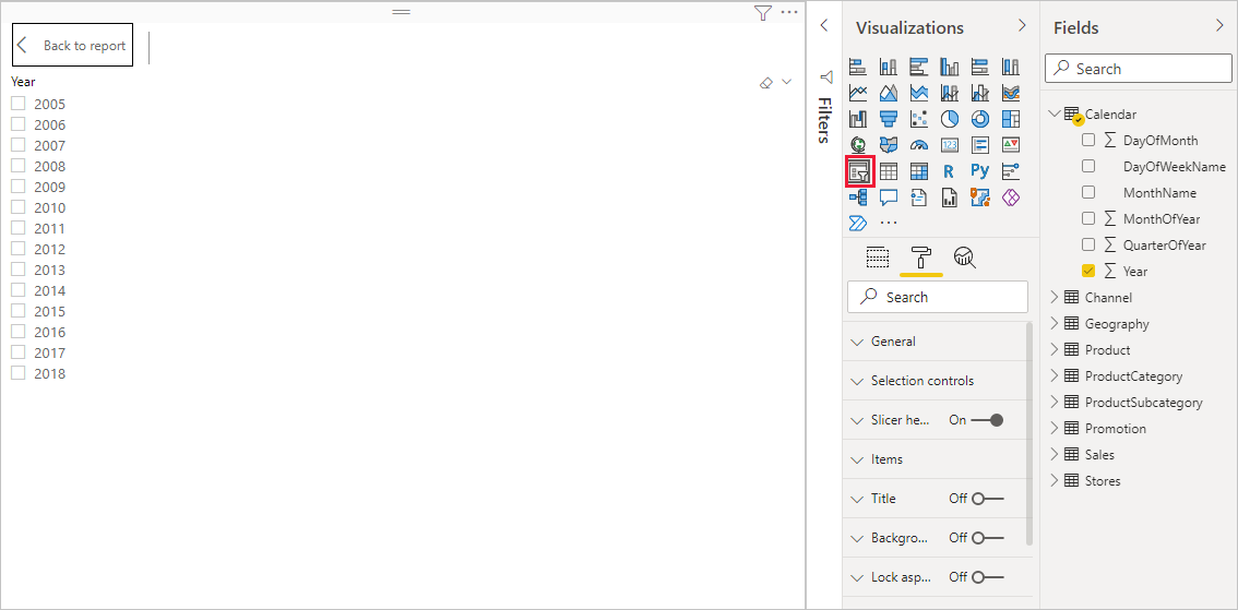
  4. Select the Slicer icon in the Visualizations pane to convert the table to a slicer. If the visualization displays a slider instead of a list, select List from the down arrow in the slider.

    Convert table to slicer

  5. Select any value in the Year slicer to filter the Net Sales and Sales Amount by RegionCountryName chart accordingly. The Net Sales and SalesAmount measures recalculate and display results in the context of the selected Year field.

    Chart sliced by Year

Use your measure in another measure

Suppose you want to find out which products have the highest net sales amount per unit sold. You'll need a measure that divides net sales by the quantity of units sold. Create a new measure that divides the result of your Net Sales measure by the sum of Sales[SalesQuantity].

  1. In the Fields pane, create a new measure named Net Sales per Unit in the Sales table.

  2. In the formula bar, begin typing Net Sales. The suggestion list shows what you can add. Select [Net Sales].

    Formula using Net Sales

  3. You can also reference measures by just typing an opening bracket ([). The suggestion list shows only measures to add to your formula.

    Bracket shows measures only

  4. Enter a space, a divide operator (/), another space, a SUM function, and then type Quantity. The suggestion list shows all the columns with Quantity in the name. Select Sales[SalesQuantity], type the closing parenthesis, and press ENTER or select Commit (checkmark icon) to validate your formula.

    The resulting formula should appear as:

    Net Sales per Unit = [Net Sales] / SUM(Sales[SalesQuantity])

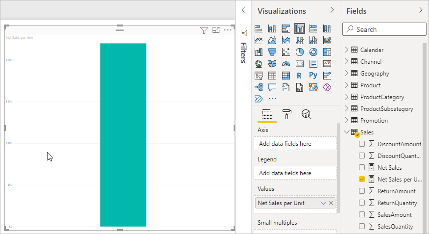
  5. Select the Net Sales per Unit measure from the Sales table, or drag it onto a blank area in the report canvas.

    The chart shows the net sales amount per unit over all products sold. This chart isn't very informative; we'll address it in the next step.

    Overall net sales per unit

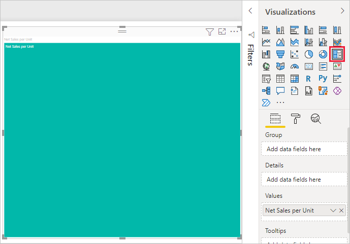
  6. For a different look, change the chart visualization type to Treemap.

    Change to treemap

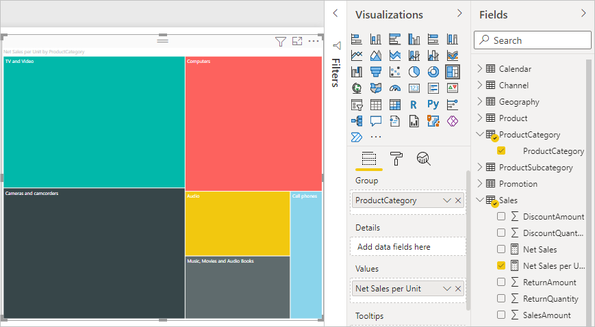
  7. Select the Product Category field, or drag it onto the treemap or the Group field of the Visualizations pane. Now you have some good info!

    Treemap by Product Category

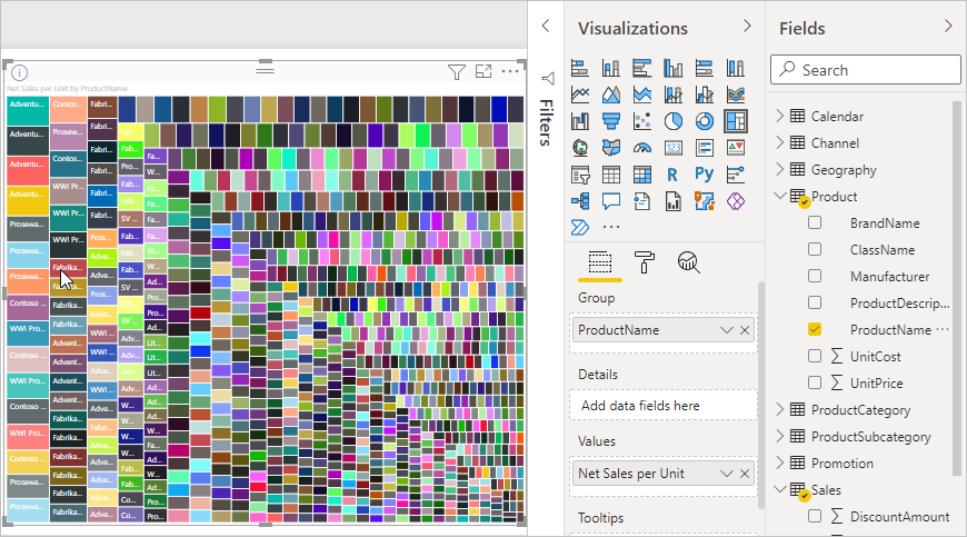
  8. Try removing the ProductCategory field, and dragging the ProductName field onto the chart instead.

    Treemap by Product Name

    Ok, now we're just playing, but you have to admit that's cool! Experiment with other ways to filter and format the visualization.


CREATING CALCULATED TABLES:

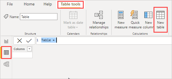
Calculated tables can be created by using the New table feature in Report View or Data View of Power BI Desktop.

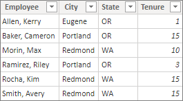
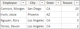
For example, imagine you're a personnel manager who has a table of Northwest Employees and another table of Southwest Employees. You want to combine the two tables into a single table called Western Region Employees.

Northwest Employees

Screenshot of Power B I Desktop showing tabular data of Northwest Employees.

Southwest Employees

Screenshot of Power B I Desktop showing tabular data of Southwest Employees.

In Report View or Data View of Power BI Desktop, in the Calculations group of the Modeling tab, select New table. It's a bit easier to do in Table tools in the Data View, because then you can immediately see your new calculated table.

New table in Data View

Enter the following formula in the formula bar:

DAX
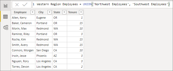
Western Region Employees = UNION('Northwest Employees', 'Southwest Employees')

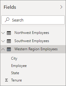
A new table named Western Region Employees is created, and appears just like any other table in the Fields pane. You can create relationships to other tables, add measures and calculated columns, and add the fields to reports just like with any other table.

New calculated table

New table in Fields pane